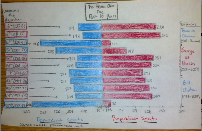
This bar graph illustrates how many seats each party has had over the last decade in the House of Representatives. While the graph does not manipulate information, it makes the information more graspable. Ultimately, it depicts how much support a President will receive in one congressional term, mapping out which side of the House is in the majority. For example, in the middle of President Barack Obama’s first term of office, the House radically changed from being a Democratic majority to a Republican one. Between the 111th and 112th congresses the physical length difference between the two bars representing Republican seats explains this shift in political opinion. During this congressional transition, Anti-Obama sentiment popularized, paving the way for the Tea Party movement. The use of color-codes to indicate each party helps to illustrate movements in congressional representation as well. By graphing the information in this way one is able to see saliently whether a President will have the political opportunity to pass legislation. When the President does not have party support in the House, political tactics like filibustering and gridlock, on the part of the opposing party, delay the policies put forth by the President. Lastly, the graph shows how greatly polarized American politics are today. Lets again take Barack Obama as an example. He is a democratic President that must deal with a republican congress, thus most of his bills do not get passed. This graph highlights America’s political shifts in opinion while also providing insight into how much House support a President will have.

This is a helpful graphic! You also do a good job explaining WHY it’s helpful. I think what the graph lacks is a bit of polish – I did NOT expect perfectly crafted computer graphics, but it does seem reasonable to expect straight lines….The lack of even this most basic level of “finish” means that your graphic will fail to convince people (they won’t take it seriously – even if this is just for your use a more polished appearance would be beneficial – it will “look” and thus be more convincing – and, thus, clear). When you post, try to proof read – for example, you should capitalize “Democrat” and “Republican.”